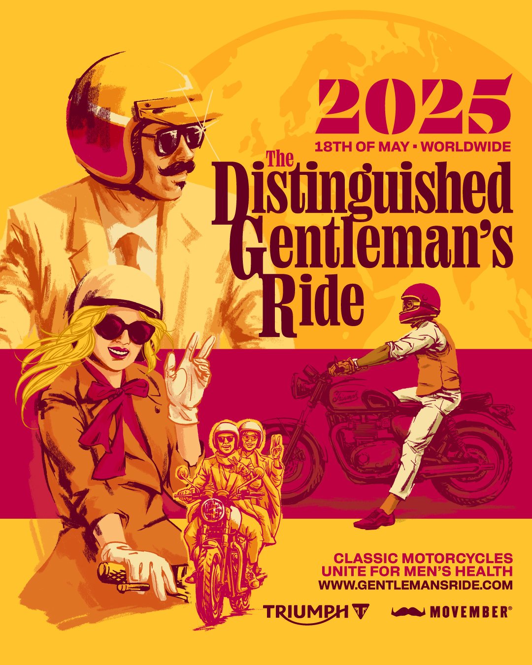
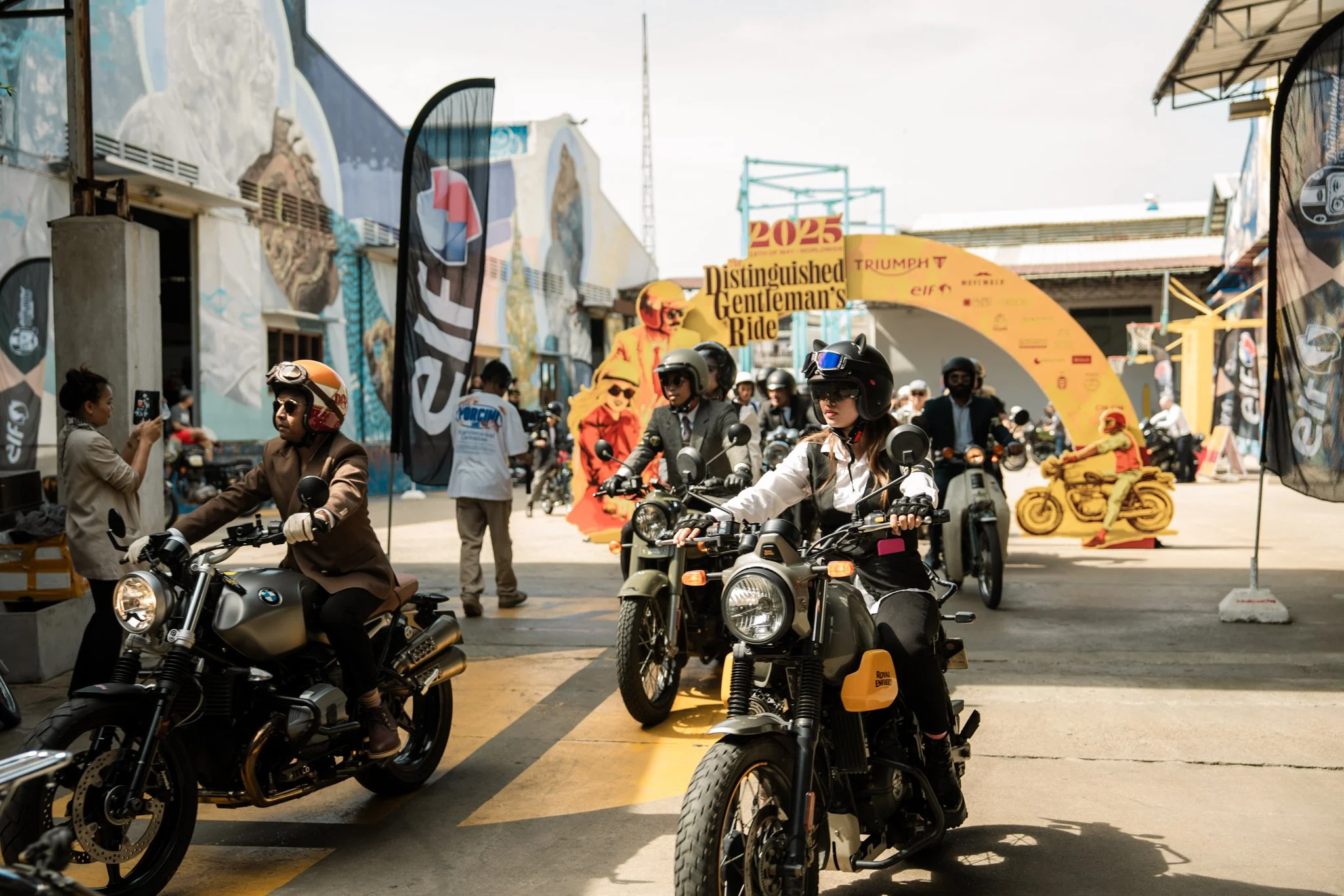
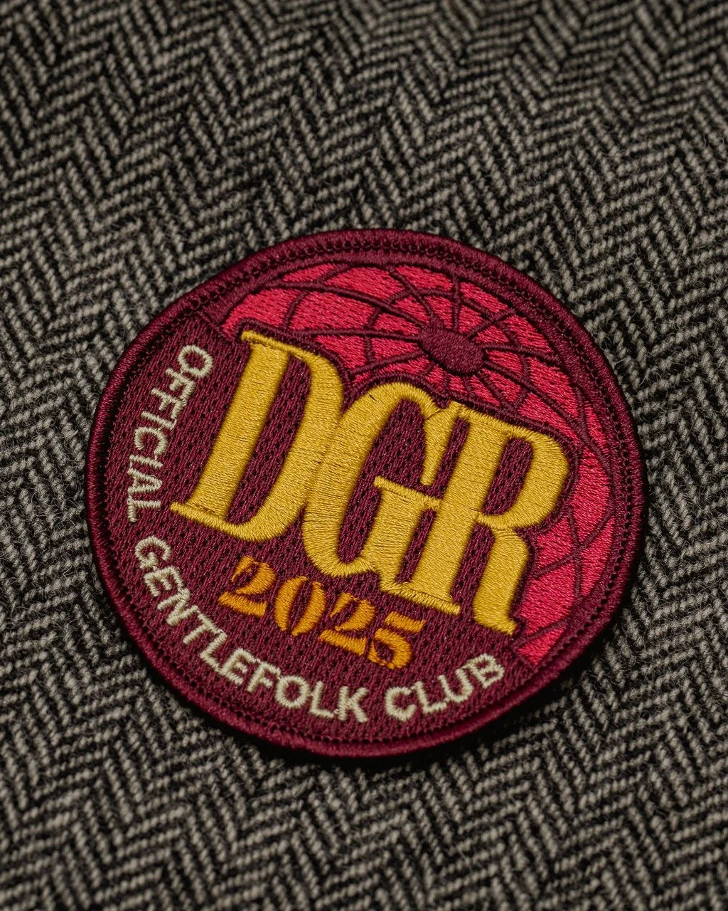
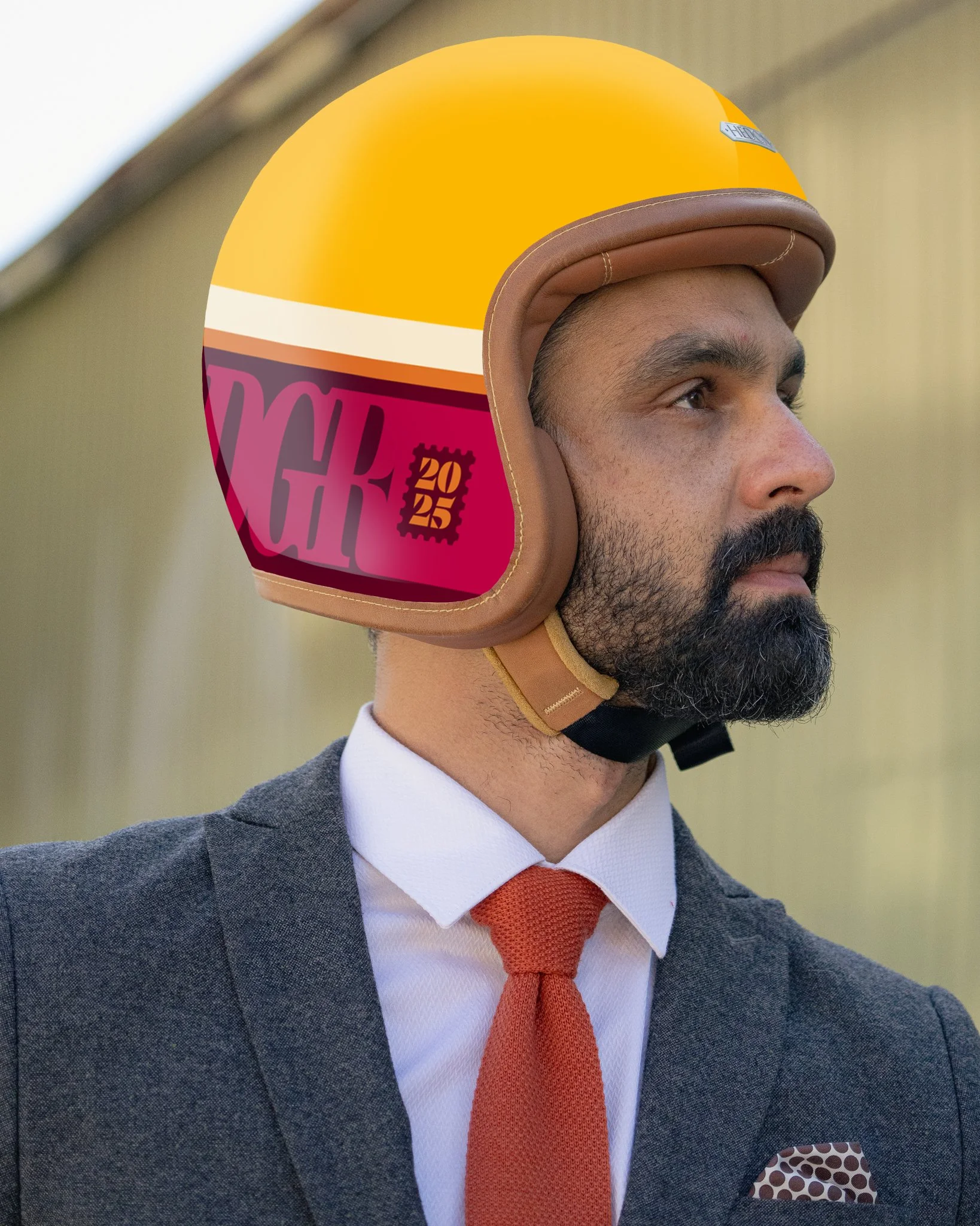
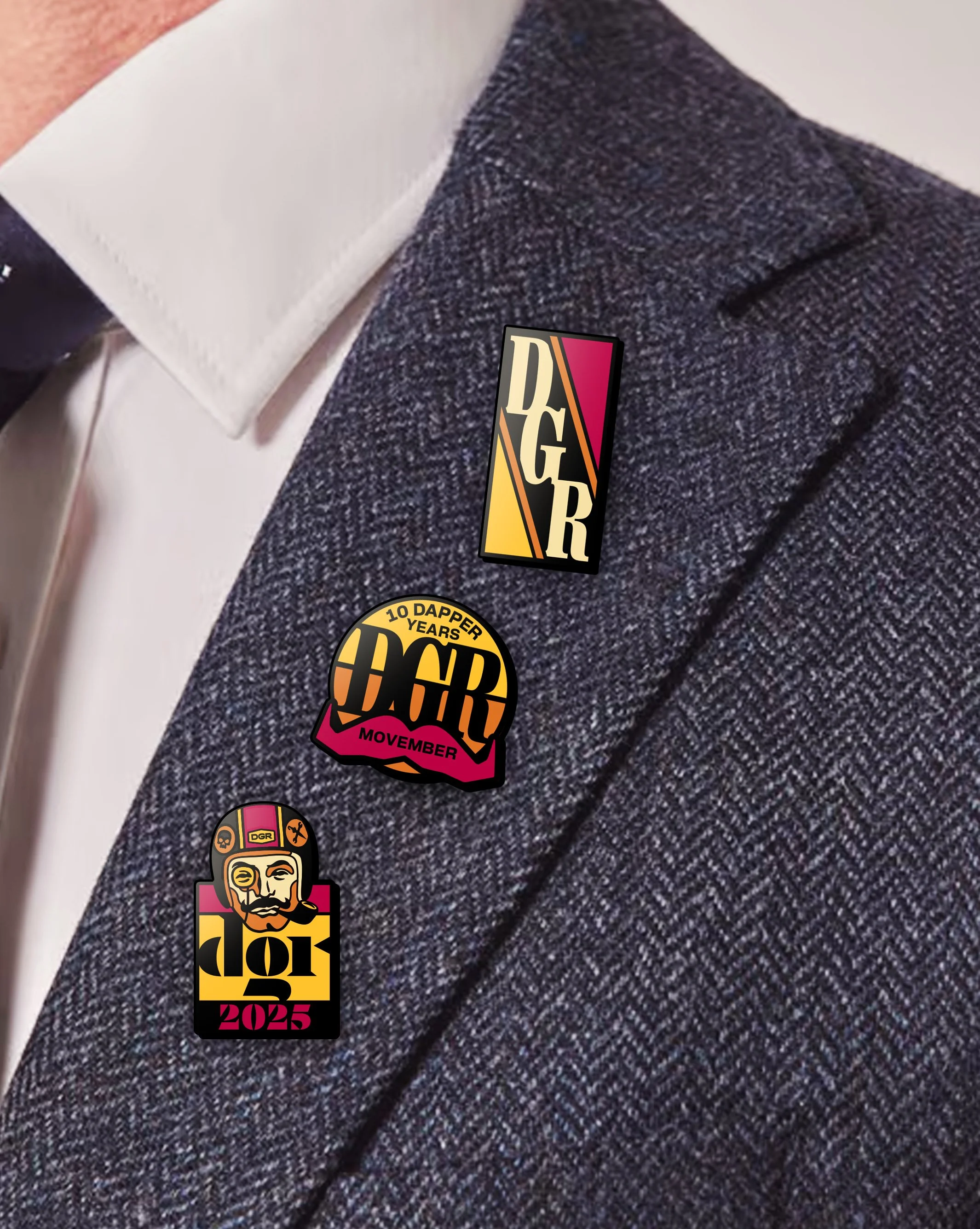
The Distinguished Gentleman’s Ride 2025
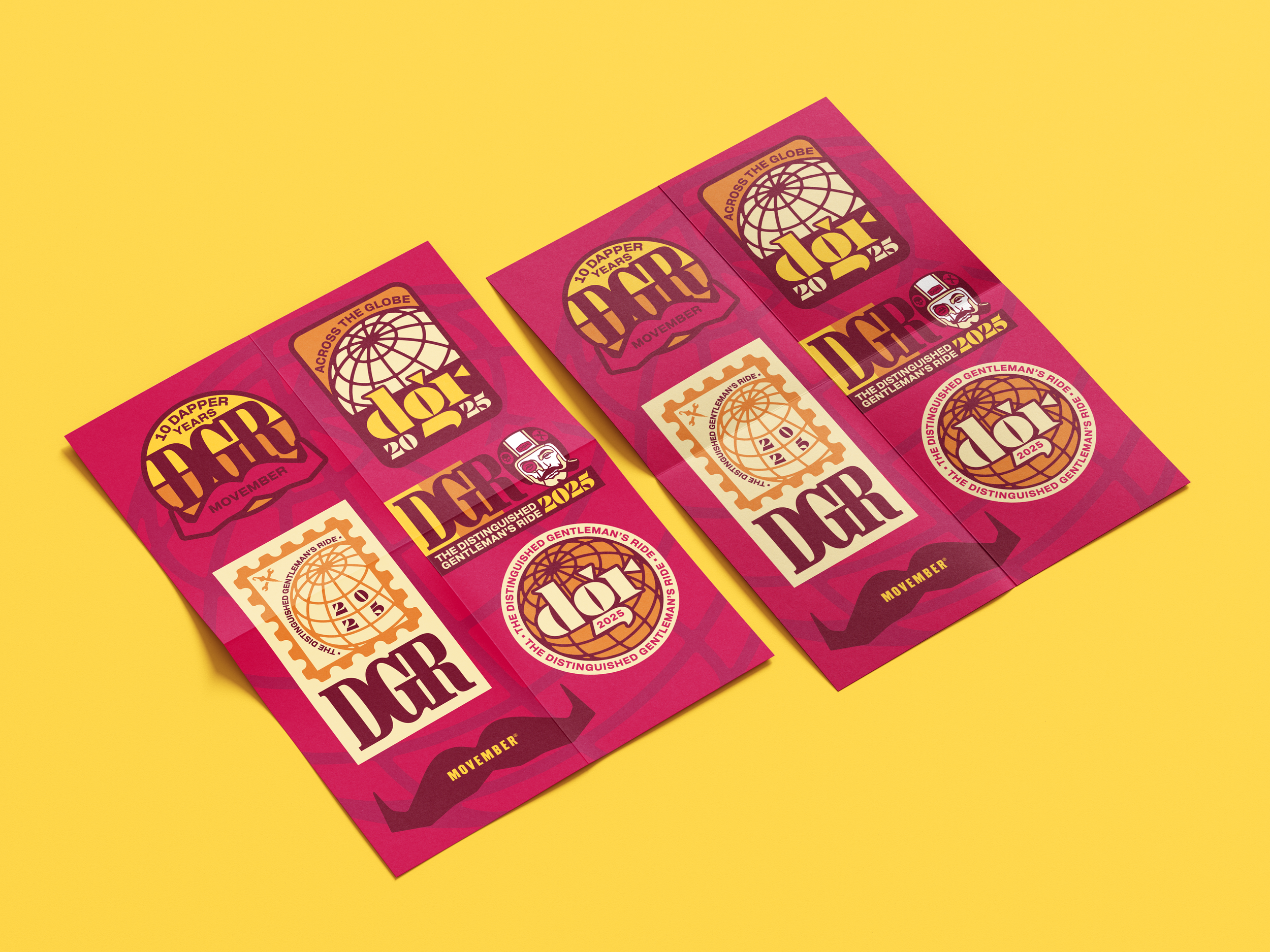
This year I really wanted to explore a vintage illustration style referencing artists like Bob Peak and Austin Briggs, drawing from references like 60s airline advertising. I felt this was a really cool way to capture the vibe of the classy suited riders as well as hint at the international nature of the event with spinning globes and other nods to airline travel. The colour palette was also a big shift, as there had never been a big yellow poster before! It’s a good and quick way to differentiate a new event’s branding from the preceding years, no one’s going to confuse it for the year before!